Fundall (an Emerging Africa Group) is a financial technology business that focuses on providing "ALL THINGS MONEY" to its subscribers. When the firm was bought, the product was anticipated to be aligned with the group's brand. While this was being done, the desire to improve the product's experience was a big priority because it helped boost our metrics. The firm provides a super app with numerous items divided into four categories, which include: SPEND, BORROW, GROW & MANAGE
Company
Fundall Technologies
Platform
Role
Year
Mobile
Product designer
2022
Backstory
In 2019/2020, Fundall launched it mobile app targeted towards serving the unbanked within the Nigerian financial ecosystem. At launch of the app, we went all in with marketing and advertisement which got the app adoption to about 77,679 users within a year.
Design Goal
User research, Prototyping, Userflow, Design systems, User interface, User experience
Revamping the homepage
Wealth
My Contributions
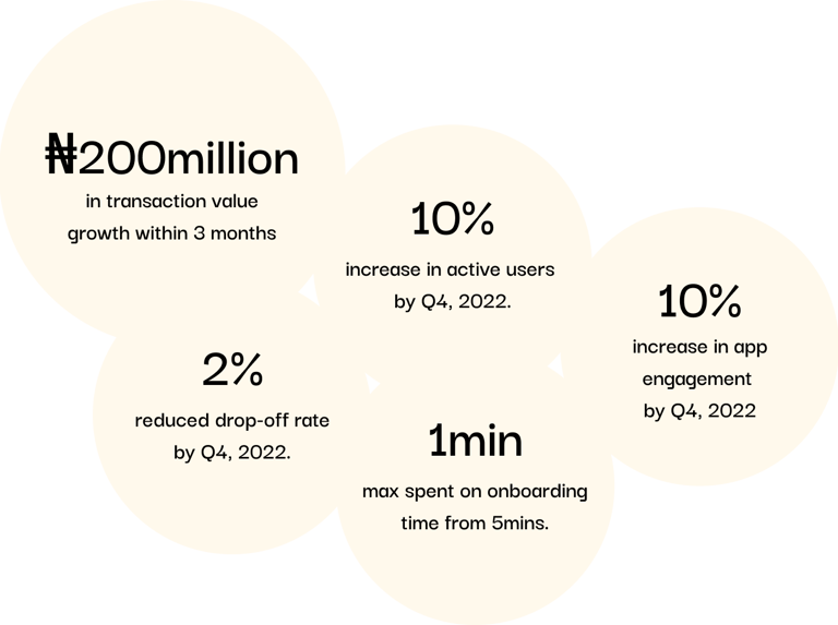
The goal was to increase active users by atleast 10% month on month
Outcome
At the end of 2023, we had grown our user base from 77,679 to over 85,817 with 10% active users and a transacting value of over 200 million naira and 4,900 card requests
Key Learnings
Working on this project made me realise how the littlest things could be the greatest solution. Also, the essence of communication, team work and managing stakeholders played a major role in ensuring we effectively arrived at a solution that was feasible enough to meet user needs.
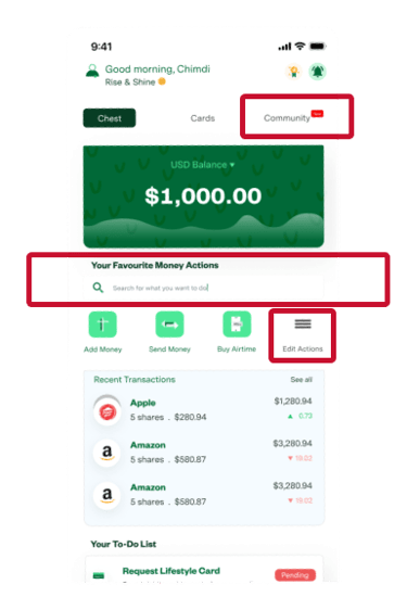
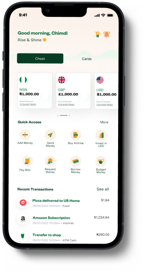
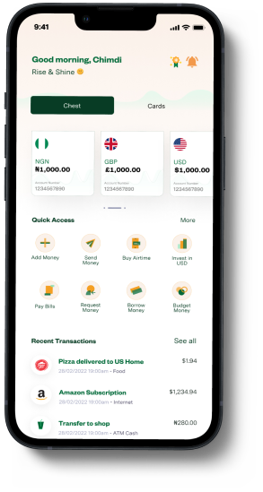
The team ran a test while revamping the site to discover how users engage with the screen, the most significant actions users take, and what is unimportant.
Following the test, we discovered the following:
The search field was unnecessary since consumers seldom utilize it to perform an activity.
The "Edit Action" button was a poor use of UX since it restricted access to other essential features.
The community button was completely unneeded. We wanted bigger buttons to enable consumers to switch between their Chest (Wallet) and Cards.
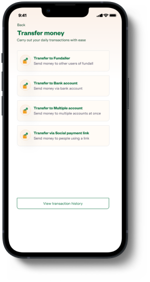
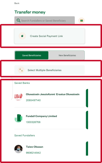
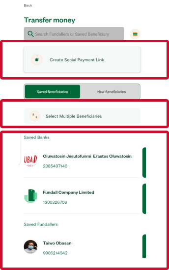
Transferring cash is a common action performed by more than 85% of active users.
While attempting to enhance this design, I did a user test in which I observed how users interacted with the app. Users were tasked with completing a transaction flow. The time to completion and the task completion rate was the key metrics employed here.
Three of the five users were able to complete the transfer job in 2:15 minutes, while the other two were unable to traverse the flow.
I proceeded to access the user's pain points. "At first sight, they were a bit perplexed as to how they would carry out the transfer task," was one key pain point shared by these users.
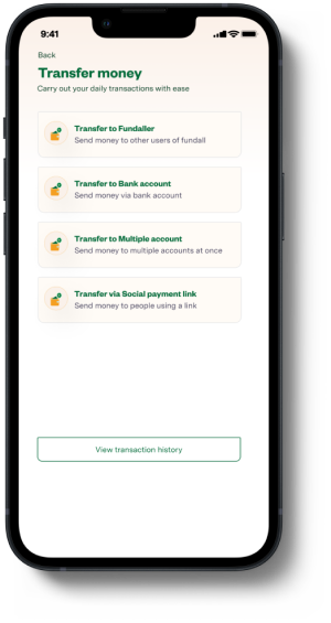
Transfer funds
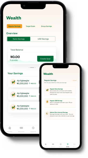
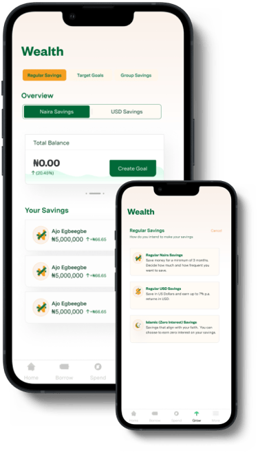
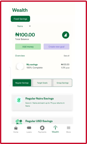
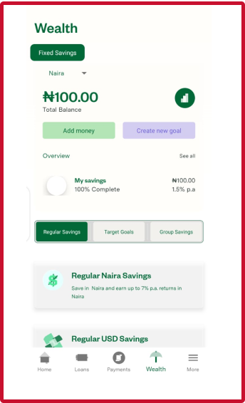
The Fundall app's Wealth section is an integral part that focuses on assisting users in growing their money. Users can receive interest on their funds in this case.
The previous functionality only allowed for Fixed savings. Following the acquisition, other services such as mutual funds and insurance were introduced to allow consumers to have a more flexible and diverse investment portfolio.
These compelled a realignment of the current information architecture. Initially, the design only catered to one category. The design now needed to cater to three different types.
This was time-consuming due to the number of iterations.
Cards
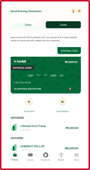
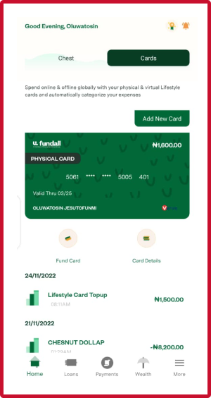
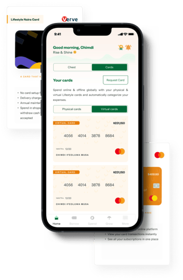
The card section is very essential because Fundall receives an average of 5 card request per week. Currently, we have 2 cards which include:
Lifestyle Naira card (Physical card)
USD cards (Virtual card)
Currently, users have access to only one physical and virtual card which our they enjoy. However, we noticed how users began to request for several cards they wish to create for their loved ones.
For example, we had a user who requested more cards for her children so that she could fund their cards on a regular basis and her children could use their cards to pay for costs.
This created the need for us to rethink the interface of the cards screen.
A brainstorming was conducted where we explored possible ways the cards screen can be represented.
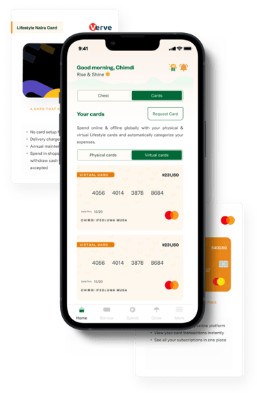
We eventually arrived at a solution where users get to carry out all possible actions at a glance. With the new screens, users can ;
1. Request a new card
2. Add a physical card
3.Switch between card categories
4. View all cards under a card category
Key feature I worked on that scaled app adoption
Overview
In the early months of 2022, We realised that our conversion rate was low and the drop-off rate was high at 30% and the lifetime value of our users was low at 5% . Also, users spent approximately 5 mins in completing the onboarding. This created a cause for alarm, and prompted the team to identify the problem.
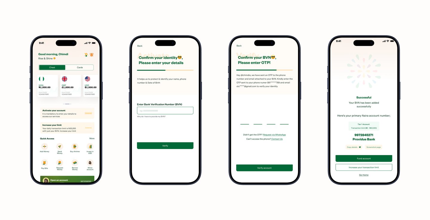
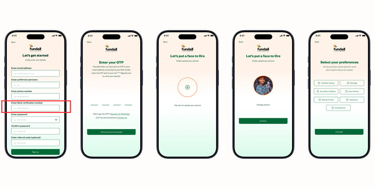
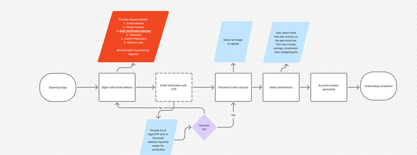
In this scenario, when onboarding into the Fundall app, users are expected to access their account number which is a necessity when creating an account on the app. However, we had a rethink of how the account number can be generated. The rethink was fueled by feedbacks gotten from our users.
When generating an account number, the Bank Verification Number (BVN) will be required. The BVN is a 10 digit number that can give anyone access to your identity as a citizen of the country which makes the BVN a very critical item people do not like to release. In our scenario, we required customers to provide their BVN data in order for us to produce an account number for their account
Activities performed...
Main Objective
To tackle the issues with increasing downloads but decreasing active users
User discovery research
Market & Competitor Analysis
Regarding this issue, we consulted over 200+ participants who were new users from the Fundall Trybe (community of users) by conducting surveys and focus groups for the sole aim of understanding how these new user viewed the experience of onboarding. With that sample size, over 70% were not able to complete their onboarding and their frustrations were quite similar, users were struggling with providing critical information that was a key requirement for generating an account number
Also, we looked at how other comeptitors approached their account generation process
Personas & Journey maps
From our findings, we drew up empathy maps to help us understand who we were solving for. Also, we critically drew up journey maps to understand the drop-off point for our users
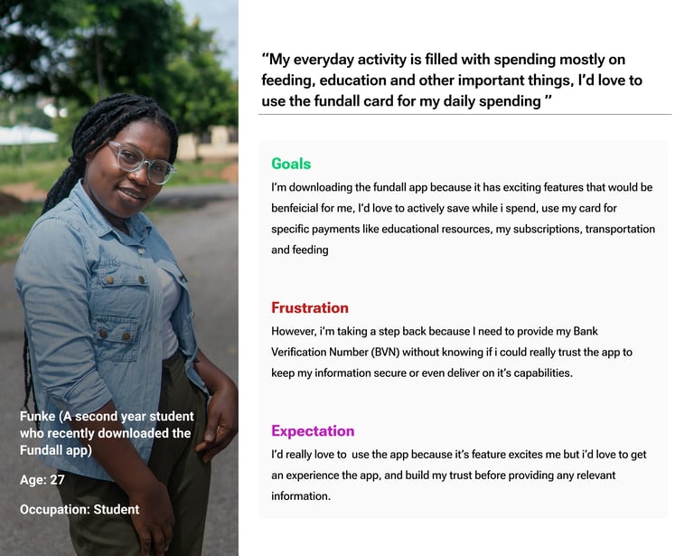
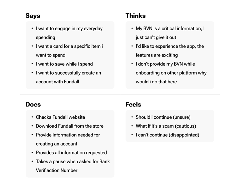
All users we consulted had something in common, they all concerned with the kind of the information they provided, in this case, it was the BVN
Empathy Mapping
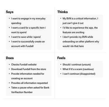
*The Empathy map created details, what was going on throught the mind of the user while trying to onboard on the project
Define & Ideation
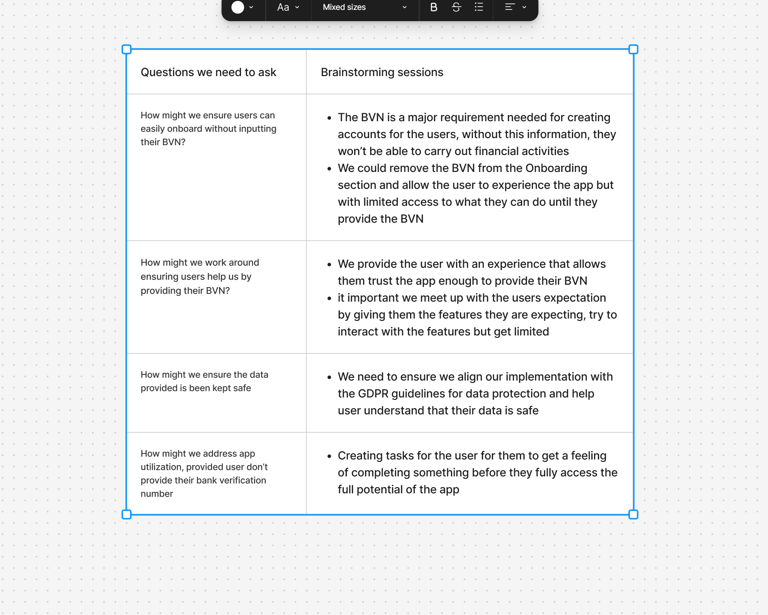
While defining and ideating, we conducted series of brainstorming sessions not just within the team but with key stakholders who have massive interest in the project
User Journey mapping - Original flow chart
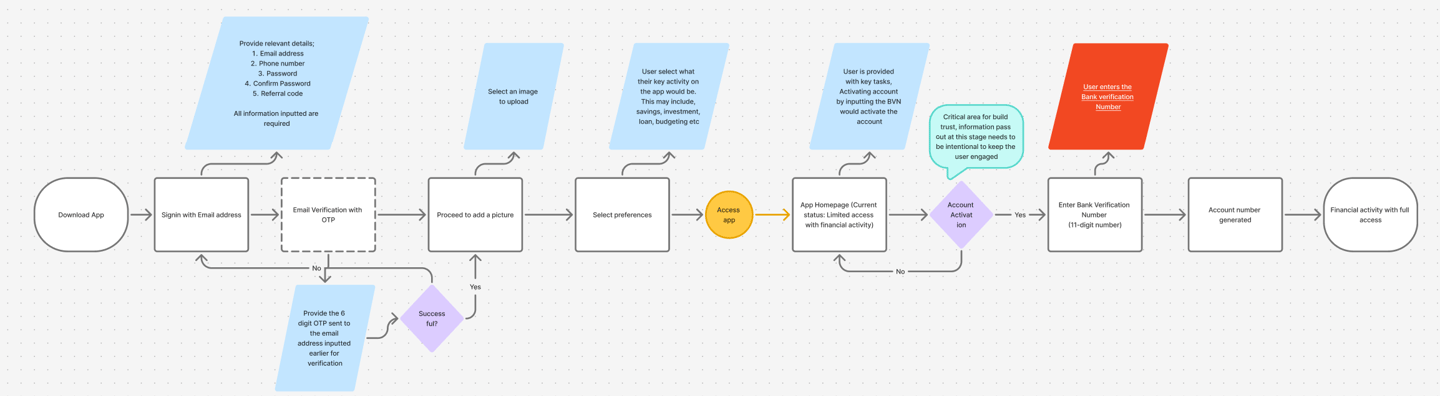
User Journey mapping - Updated Flow chart after brainstorming
To identify the best route possible in confronting the issue with onboarding
Main Objective
Activities performed...
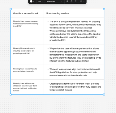
Using the HMW Framework, we asked relevant questions that fueled the brainstorming session facilitated by me. We were able to think through relevant answers that provided insights into how we might approach the main problem, we then compared with the industry standard which gave a feasible option that we could test.
Solution derivation & Ideation sessioins
Inorder to test our solution, i worked on wireframes and micro interactions that gave an insight into how we were approaching the solution
Low fidelity wireframe, Prototyping & Micro interaction
Design & Development
I created a seamless flow of how users were able to generate account number by providing the BVN and not having to stress about providing information while onboarding into the app
Other screens developed...
Challenges
Our key challenge during the course of the project was regulatory complaince, trying to find a balance between key regulatory requirements and user need remained a focal point for continous delibration.
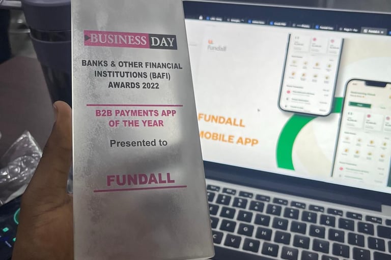
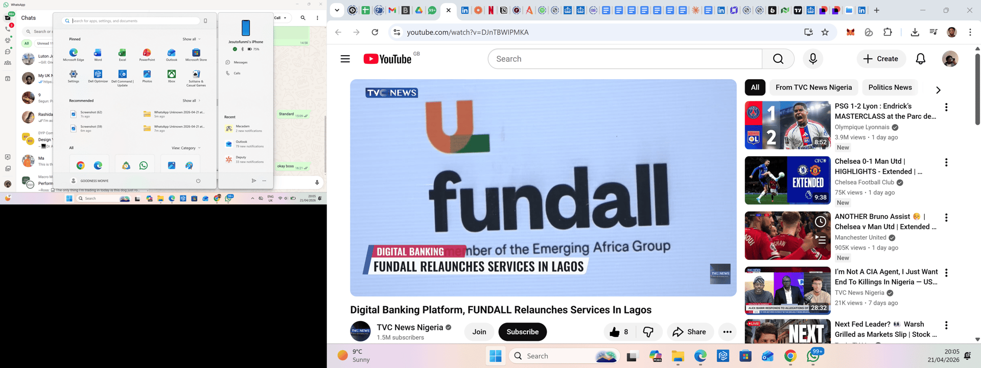
Major Highlights in 2022
Key Metrics
QA Testing
Worked alongside with the QA team in ensuring the app was functional, bug free and usable by users. Also, I facilitated session where the team proactively utilised the app internally before pushing build out to the public.