Keys Community is a residential-industry startup building a platform for self-developing communities enabling residents to post news, run polls, share updates and events, join clubs, and fund communal projects, while vendors deliver and track services within those same neighbourhoods. This case study covers my work translating a broad, early-stage product idea into a phased, end-to-end V1 built for launch.
Company
Aptap
Platform
Role
Year
Web
Product designer
2026
Improving conversions through clicks


Backstory
I joined Keys in 2025, at a point where the company had already been through several rounds of early development but hadn't yet converted its ambition into a coherent, buildable product. The core challenge wasn't a lack of ideas it was the opposite: a genuinely complex, multi-sided concept (residents, vendors, community funding, communal activity) that needed to be broken down into something a small team could design, build and ship in phases, with a V1 that could go live on the app store.
Rather than attempting to design the full vision at once, the team ran a series of structured working sessions to break the idea down, mapping requirements, defining user journeys, and stress-testing what "done" looked like for a first release. These sessions were less about polishing screens and more about creating shared clarity getting everyone aligned on what the product actually was before committing design and engineering effort to it.
As Product Designer, I contributed directly to this process: taking part in brainstorming sessions, crafting user journeys and micro-interactions, and using AI tools (Claude) to move quickly from concept to something the team could react to and refine, rather than waiting on lengthy static design cycles. I worked across both sides of the platform residents and vendors since Keys' core value only holds if both groups' experiences work together.
The Problem
The Process
Keys Community's core proposition, self-developing communities where residents and vendors interact directly depended entirely on a product that didn't exist yet in any coherent form. The company had spent its early stage iterating on the concept, but that iteration had produced complexity rather than clarity: a wide surface area of features (news, polls, events, clubs, funding, vendor services) with no agreed sequencing, no shared user journeys, and no defined boundary around what a first release actually needed to include.
This created two compounding risks.
First, a stalled or endlessly-scoped build: without a phased structure, a startup with this many interconnected feature areas risked never shipping, as each session surfaced new requirements rather than converging on a testable version.
Second, a fragmented experience: because Keys is inherently two-sided residents generating community activity and funding, vendors delivering and monetising services within it designing either side in isolation risked a product where one half worked and the other didn't, undermining the platform's actual value proposition of a functioning, self-sustaining community loop.
The problem, then, wasn't "what should this app do" the ambition was already clear. It was translating that ambition into a sequenced, buildable product: identifying which resident and vendor journeys were essential to prove the concept, and getting the team to a shared, specific enough definition of V1 that design and engineering could commit to shipping it.
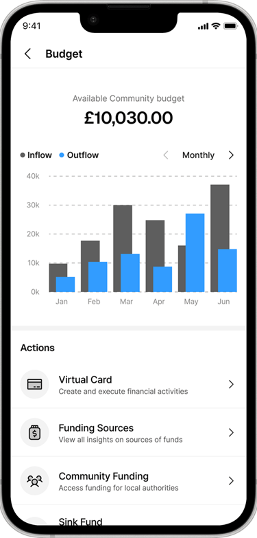
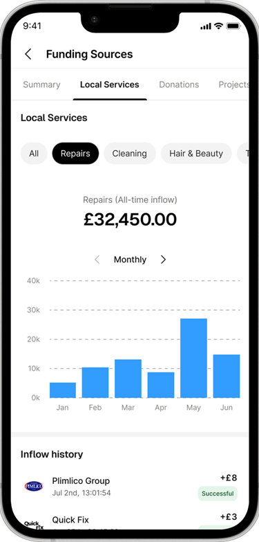
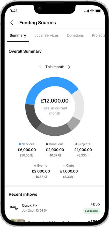
Communal project funding; One of the areas I focused on was giving residents clear insight into how their community is funded. Keys communities receive money through several distinct sources service charges, donations, and returns generated by previously funded community projects, and the design challenge was making that mix legible rather than abstract, so residents could understand where community funds actually come from and how established projects were paying back into the community over time.
Solution exploration
Key learnings
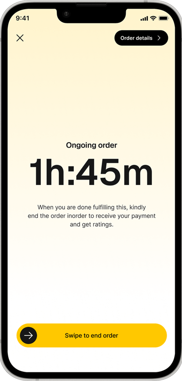
The clearest lesson from Keys was that clarity has to be manufactured deliberately in an early-stage, multi-sided product, it doesn't emerge on its own from good intentions. Structured sessions that broke the idea into requirements and journeys did more to move the product forward than any individual screen design, because they forced the team to agree on scope before committing to detail. Designing for two distinct user types (residents and vendors) also reinforced that shared platform value has to be built from both sides deliberately, rather than assuming a good resident experience will naturally translate into vendor engagement, or vice versa. And the vendor service-timer screen was a good reminder that removing features from a screen is sometimes the highest-value design decision available, especially in moments where a user's real attention needs to be elsewhere.
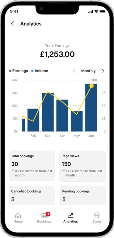
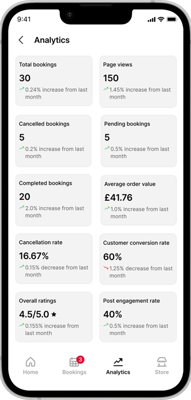
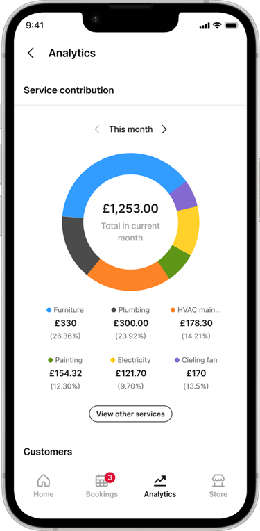
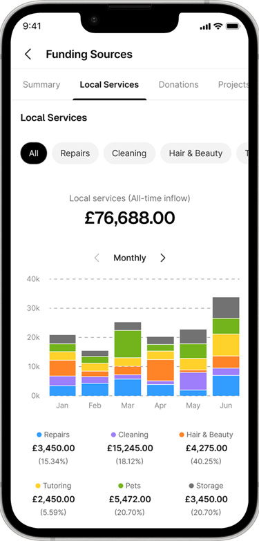
Vendor Analytics; For vendors, I designed the analytics experience that sits behind their day-to-day business activity on the platform: giving them visibility into how their business is performing within the community and, specifically, which of their services is contributing the most to their revenue. This mattered because vendors needed a reason beyond goodwill to stay active on Keys analytics turned participation into something they could manage as a business, not just a listing.
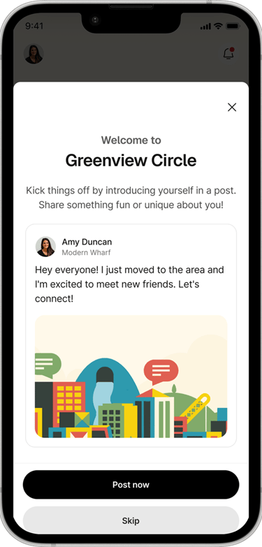
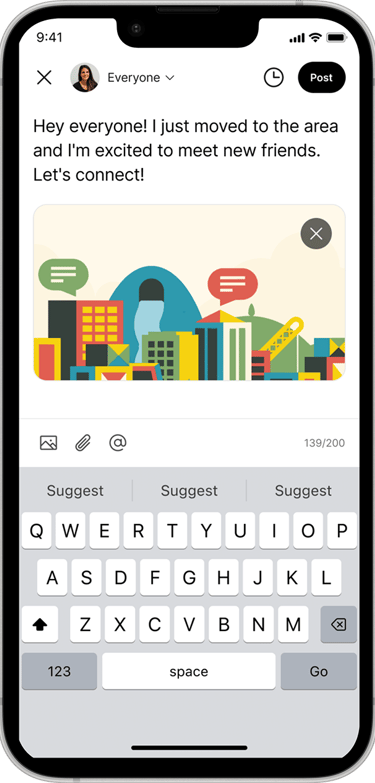
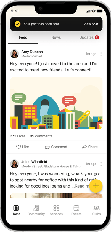
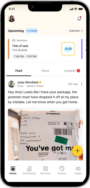
Welcome prompt for new community members; When a new user joins a community, the app surfaces a proactive prompt encouraging them to engage with other residents. This served two purposes at once: it nudged the new resident toward early activity (posting, joining, connecting) rather than landing on a quiet, empty-feeling app, and it quietly informed existing neighbours that someone new had joined their community, turning onboarding into a small moment of shared visibility rather than a private, one-sided setup flow.
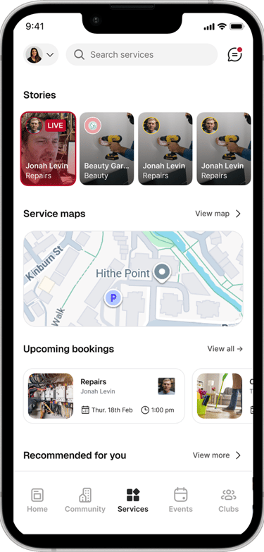
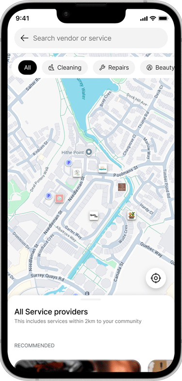
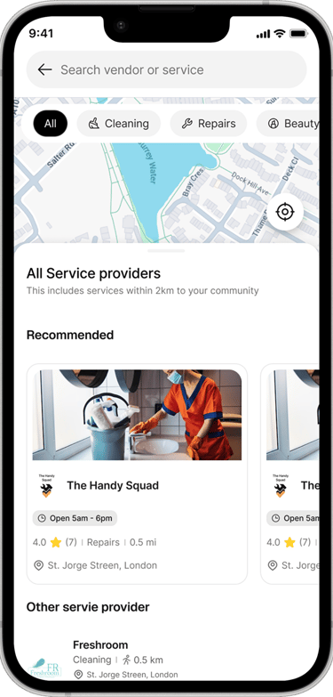
Local service delivery; Access to nearby services is one of the most practical, everyday needs for a resident, so this feature was built around proximity: helping residents find and reach the services closest to them within their community, rather than presenting an undifferentiated list of everything available on the platform.
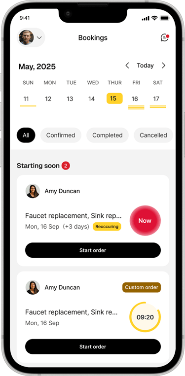
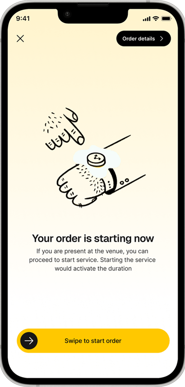
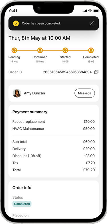
Vendor service flow; A lot of intention went into the flow for how a vendor actually starts and runs a service. When a service is needed, whether at the resident's location or the vendor's own the vendor receives an alert to begin the job. Once the service starts, the interface is deliberately stripped back: the vendor sees only a running timer for the service in progress and a single control to end it. That restraint was a conscious design decision during an active service, the vendor's attention should be on the job itself, not on navigating the app, so anything not essential to "service is running / service is done" was removed from the screen.