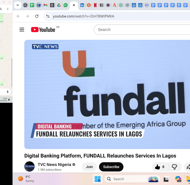
Fundall (part of Emerging Africa Group) is a fintech business focused on providing "all things money" to its subscribers. When the company was acquired, the product needed to align with the group's new brand and alongside that, improving the product experience became a priority because of its direct impact on our metrics. The app offers a super-app experience across four categories: Spend, Borrow, Grow & Manage
Company
Fundall Technologies
Platform
Role
Year
Mobile
Product designer
2022
Tackling the increasing rate of inactive users


₦200M
10%
increase in active users by Q4
in transaction value growth within 3 months
5mins -> 1 min
max spent on onboarding time from 5mins
Backstory
Fundall is a financial product built for the unbanked, offering "all things money" across four categories: Spend, Borrow, Grow and Manage. When the company was acquired by Emerging Africa Group, the product needed to align with the group's brand but the bigger priority was improving the product experience itself, because that's what moved the metrics that mattered.
Design Goal
Revamping the homepage
Wealth

The goal was to increase active users by atleast 10% m-o-m
Outcome
By the end of 2023, we'd grown the user base from 77,679 to over 85,817, with 10% of users active and a transacting value of over ₦200 million, alongside 4,900 card requests. Onboarding time dropped from around 5 minutes to under 1 minute.

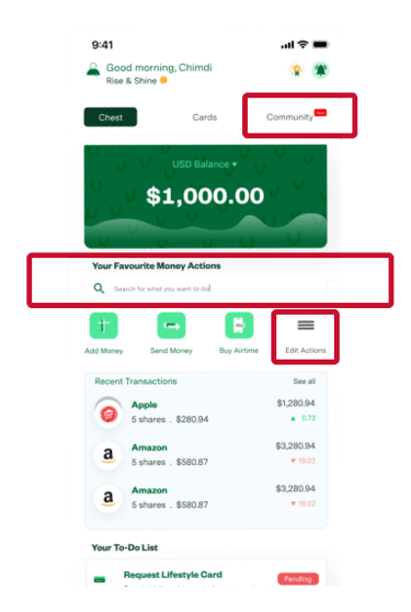
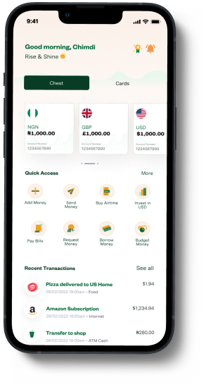
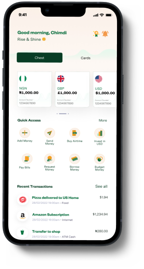
We ran usability tests on the existing homepage to understand how users engaged with it, which actions mattered most, and what didn't.
We discovered:
The search field was rarely used and could be removed
The "Edit Action" button restricted access to more essential features and was a poor use of space
The community button was unnecessary we needed bigger, clearer buttons to switch between Chest (Wallet) and Cards
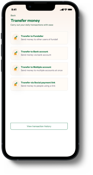
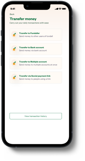
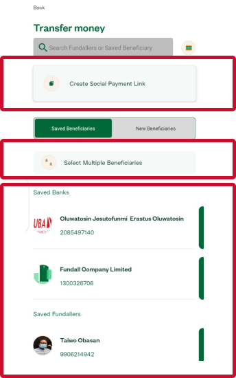
Transferring funds was a common action for 85%+ of active users. To improve this flow, I ran a usability test observing how users completed a transfer task, measuring time-to-completion and task success rate. 3 of 5 users completed the transfer in 2:15 minutes; the other two were unable to complete it. Their key pain point: confusion about how to initiate the transfer in the first place.
Transfer funds


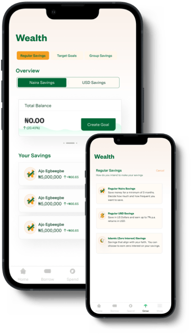
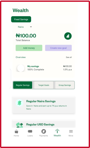
The Wealth section helps users grow their money and earn interest. Previously, it only supported fixed savings; after the acquisition, we introduced mutual funds and insurance, giving users a more flexible, diversified investment portfolio. This required realigning the information architecture from a single-category design to one supporting three product types, a time-consuming but necessary iteration.

Cards
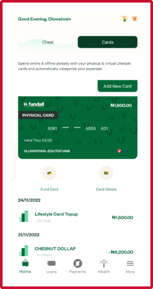
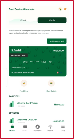
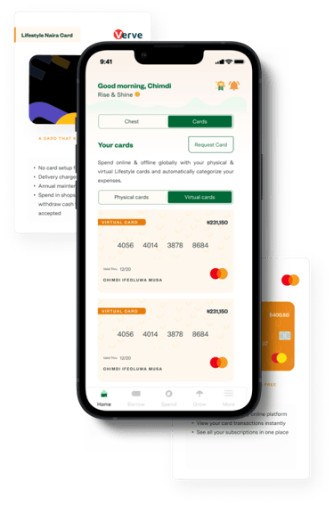
Fundall receives an average of 5 card requests per week, across two card types: a physical Lifestyle Naira card and a virtual USD card. Users could previously only hold one of each but we noticed a growing pattern of users wanting multiple cards, for example a parent wanting separate funded cards for each of her children.
This led us to redesign the cards screen so users could, at a glance: request a new card, add a physical card, switch between card categories, and view all cards within a category.

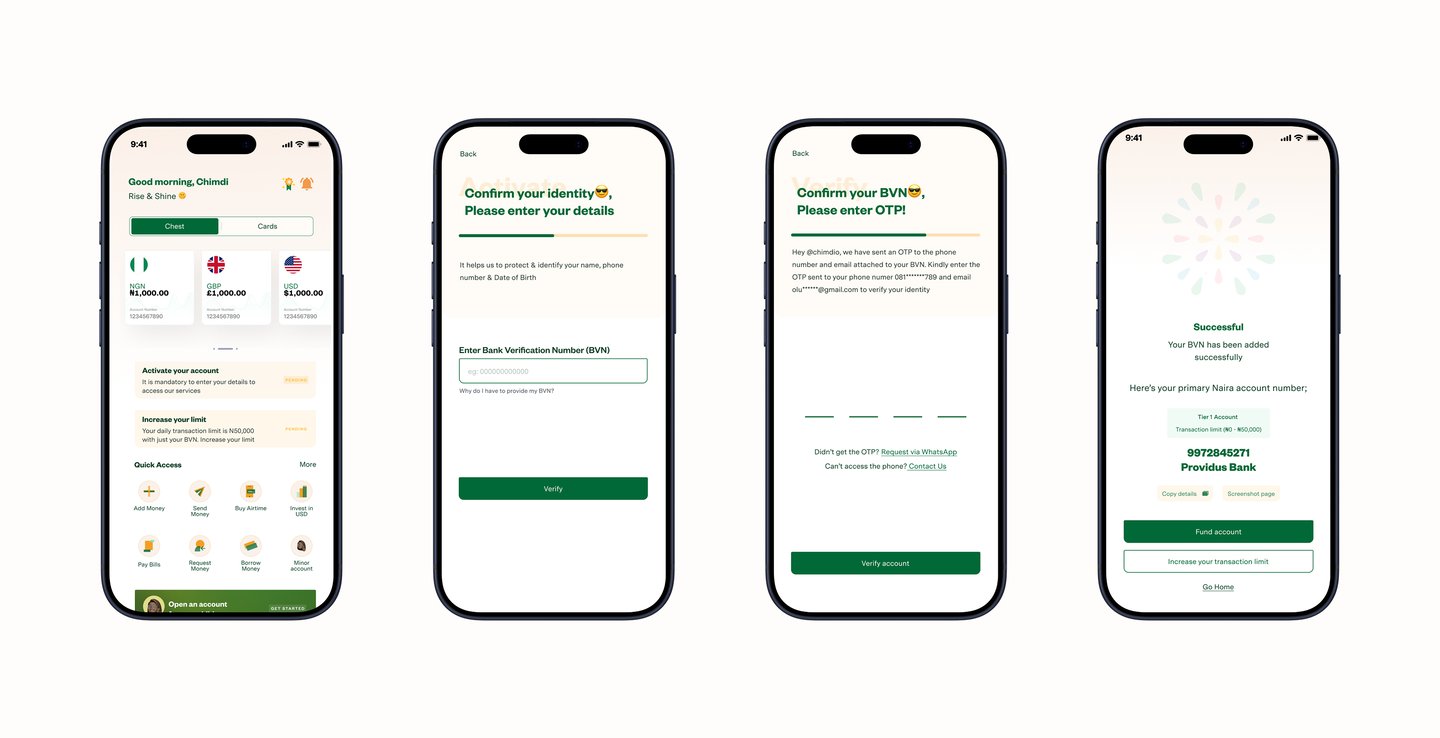
In early 2022, conversion was low and drop-off was high , around 30% and user lifetime value sat at just 5%. Users spent roughly 5 minutes completing onboarding, a major contributor to drop-off. Onboarding required users to provide their Bank Verification Number (BVN) a 10-digit number that grants access to a user's identity as a citizen, and understandably something people are cautious about sharing. Our research confirmed this was the core blocker
The main objective was to tackle the issues with decreasing active user even when downloads were increasing
User discovery research
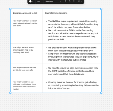
I ran discovery with over 200 participants from the Fundall Trybe community via surveys and focus groups. Over 70% weren't able to complete onboarding, and their frustrations were nearly identical: providing the BVN felt like the sticking point. I mapped empathy maps and journeys to pinpoint exactly where users dropped off, then used the HMW framework to run a facilitated brainstorm, comparing our ideas against industry standard approaches before testing a feasible option.
Personas & Journey maps
We built empathy maps to understand who we were solving for, and journey maps to pinpoint exactly where inactive users dropped off.

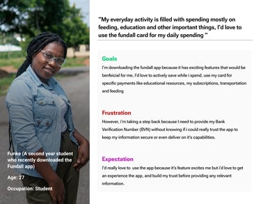

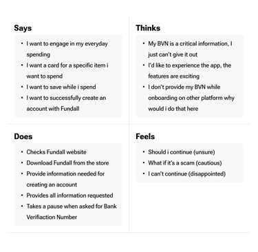
The Empathy map created details, what was going on throught the mind of the user while trying to onboard on the project

Define & Ideation
We ran brainstorming sessions with the team and key stakeholders, using the HMW framework to generate and evaluate possible directions, benchmarked against industry standards to find a feasible option to test.
User Journey mapping - Original flow chart

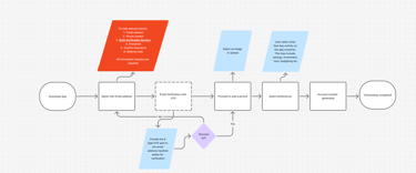

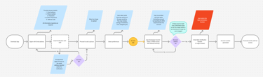
User Journey mapping - Updated Flow chart after brainstorming
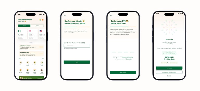
I worked on low-fidelity wireframes, prototypes and micro-interactions to explore how we could simplify the flow ultimately designing a seamless way for users to generate an account number by providing their BVN, without the onboarding experience feeling invasive or stressful.
Solution & Design
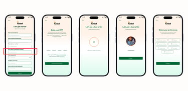
Other screens developed...
Key Learnings
The biggest challenge throughout was regulatory compliance, finding the balance between what the business needed to verify and what users were willing to hand over, without letting either one win by default. It reinforced how the smallest interaction detail (in this case, one form field) can be the actual blocker standing between a user and an active account.
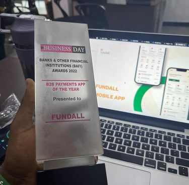
Major Highlights in 2022/2023


QA Testing
I collaborated with the QA team to ensure the app was functional, bug-free and usable, and ran internal sessions where the team used the app before releasing builds publicly.
The Problem
Empathy Maps
Identifying the issue